Brookings Opening Film Sequence
Role: Concepting, Graphic Design, Motion Design, Art Direction
Film opening and title sequence for
Brooking’s ceremony event film
The documentary film studio Pf Pictures was commissioned to direct the film for Brooking’s Institute to celebrate their second century anniversary. For this project, I was hired to create the opening segment and title sequences of the film. This title was intended to introduce the work of Brookings and recap the highlight historical event that Brooking were at the root of. The team at Pf pictures shared all the photographs and all the key moment and chronology that had to be followed.
The documentary film studio Pf Pictures was commissioned to direct the film for Brooking’s Institute to celebrate their second century anniversary. For this project, I was hired to create the opening segment and title sequences of the film. This title was intended to introduce the work of Brookings and recap the highlight historical event that Brooking were at the root of. The team at Pf pictures shared all the photographs and all the key moment and chronology that had to be followed.
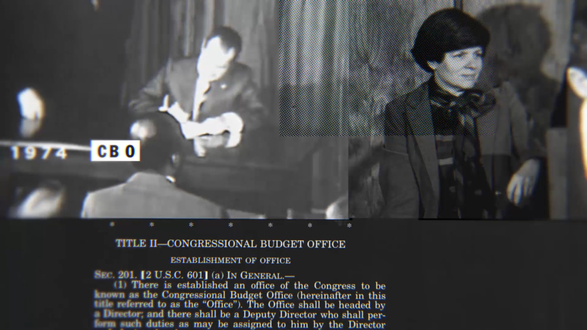
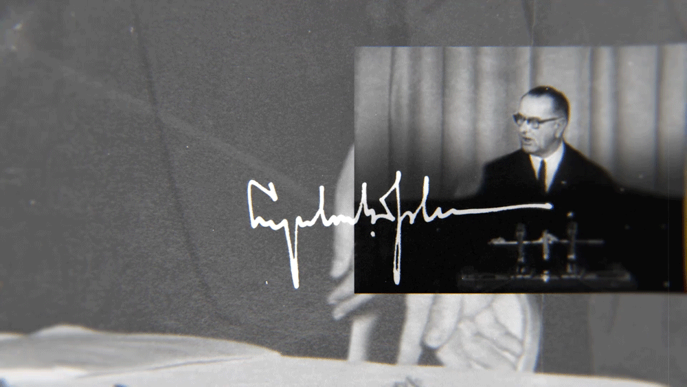
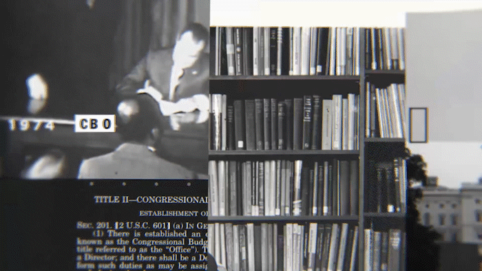
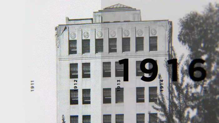
From there I designed the style frames and once the esthetic was validated I proceed into designing every frame into a storyboard. For this project that uses archive images and footage I chose a motion graphic vocabulary that evokes a mechanical and analogue feel.
It is inspired by the actual physical machine known as a microform. The abrupt cuts, flashes, newspaper halftones, use of overlays and blending modes, truncated and photocopying effect and overlapping layers.
Agency: Pf Pictures, nyc
Agency: Pf Pictures, nyc
This project was made using archive images and footage with a motion graphic vocabulary that evokes a mechanical and analogue esthetic. It is inspired by the actual physical machine known as a microform. The abrupt cuts, flashes, newspaper halftones, use of overlays and blending modes, truncated and photocopying effect and overlaping layers. The font choices for this was Franklin Condensed black and Gotham Black. I wanted to use typefaces that viewers subconsciously associate with official document (Franklin) and political campaign (Gotham). The purposefully uneven space between the letters in there to accentuate the mechanicity of the look, and to add a treatment that will differentiate from the habitual usage, to offer a new interpretation.
The usage of font Gotham Bold was chosen for the collective awareness of the political calling of it’s esthetic. I have treated it with a dramatic tracking between the letters, this treatment bring an editorial feel to the compositions and therefore a storytelling design.
Franklin on the other hand is an older typeface, it’s iconography recalls for much historical use in newspaper headlines in the early years of the 20th century. The font combination creates an interesting contrast of two different era speaking a different language supporting the same solemn intent.
Franklin on the other hand is an older typeface, it’s iconography recalls for much historical use in newspaper headlines in the early years of the 20th century. The font combination creates an interesting contrast of two different era speaking a different language supporting the same solemn intent.
Selected Frames and clips