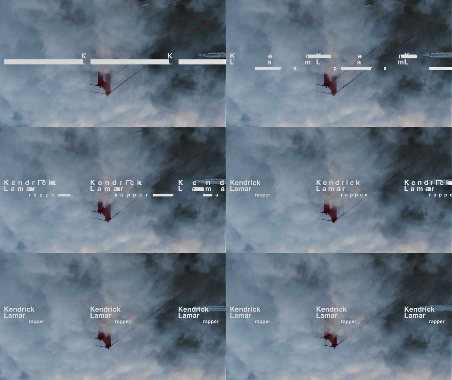
Noisey World Vice Title Sequence
Role: Concept, Graphic Design, Motion Design
Noisey World is a show about music and music culture around the globe - from Compton to Sao Paolo, Miami and Atlanta. Vice needed a designer to help shape the identity of the show, including its opening credit sequence, lower thirds and more. My concept got chosen and I received the green light to develop it further. The first shot of the opening title that I created became the model I used to create the others. The shot comprised of layered highways, overlapping each other. I found aerial shots of Atlanta highways, which I rotoscoped and pasted one on top of each other, creating a mesmerizing visual, which uses real-life footage to evoke a surreal, otherworldy atmosphere.
These highways weaving together are reminiscent of the webbed cables you might find among the machines of a recording studio.
This shot blends the themes of travel and music in a surreal, illusory way - setting the tone for the rest of the project. For the other shots, my process was to dig into Vice’s archival footage, in search of other shots which present a new idea which would complement the initial shot. I combined shots made for the Noisey show with b-roll from countless hours of Vice’s other material.
This shot blends the themes of travel and music in a surreal, illusory way - setting the tone for the rest of the project. For the other shots, my process was to dig into Vice’s archival footage, in search of other shots which present a new idea which would complement the initial shot. I combined shots made for the Noisey show with b-roll from countless hours of Vice’s other material.
Vice’s team requested that we integrate musical instruments and devices into the sequence. For example, I used a vinyl in place of a sky, and the levels from a mixing board’s controls to resemble the cars going up and down the streets.
Once all the shots were made, I designed and animated the title “NOISEY” in such a way that it could be re-edited for each new episode and integrated into the names of the different cities - adding an extra level of challenge to this part of the production. The same considerations were given to the lower thirds and end credits too. Noisey was aired on VICELAND and Vice’s streaming online platform.
Once all the shots were made, I designed and animated the title “NOISEY” in such a way that it could be re-edited for each new episode and integrated into the names of the different cities - adding an extra level of challenge to this part of the production. The same considerations were given to the lower thirds and end credits too. Noisey was aired on VICELAND and Vice’s streaming online platform.
Once I found a an initial shot, I would rotoscope it and combine it with one, two or three other shots. Rotoscoping is the action of making a mask, cutting out an element frame by frame, so the cutouts seem to follow the camera movement and the motion of the object. This process is highly time-consuming, but very rewarding once all the parts come together create a surreal-looking image.
Project Breakdown
1/6
![]()
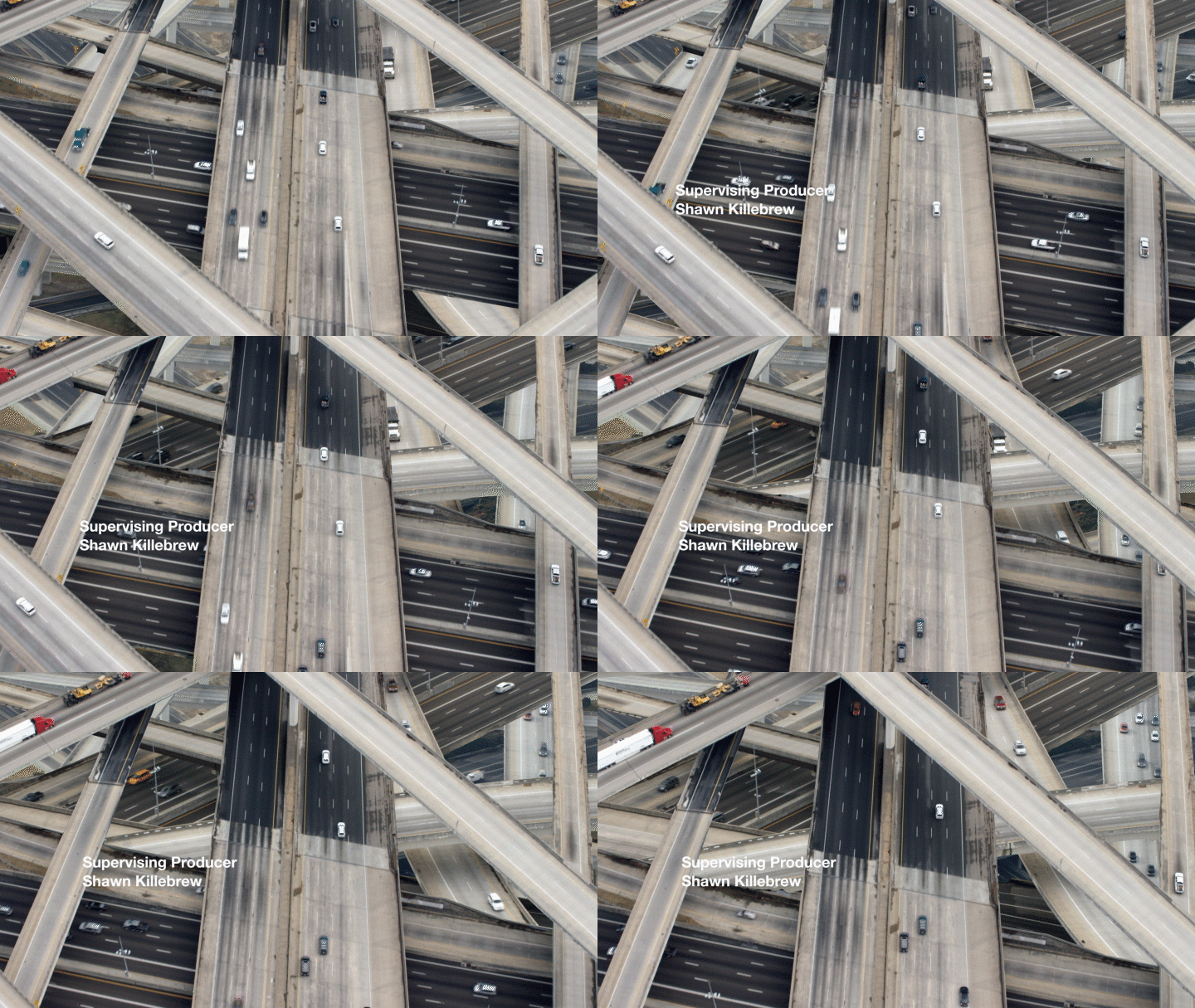
I found a collection of aerial shots over Atlanta highways from Vice’s video library. I painstakingly rotoscoped three separate shots, and made a cutout between the roads, laying them to create a mesh of highways. The reminded me music hardware cables running behind the consoles.
2/6
![]()
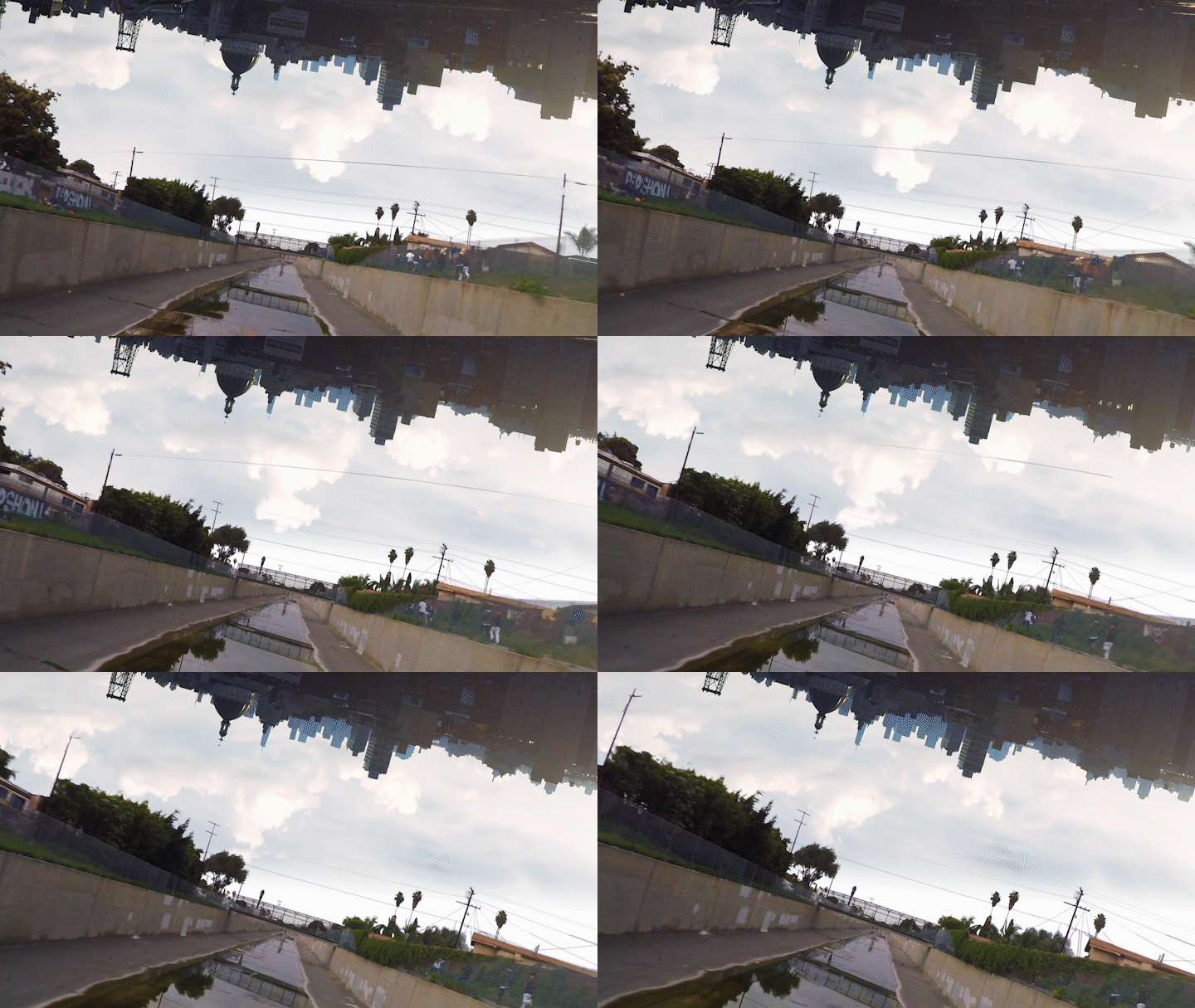
This is the opening shot, of the title sequence. The bottom is a shot of Compton with kids running. The top shot is shot in Brooklyn.
A big part of this project was to dig in Vice’s video library and try to uncover “hidden gems” of shots that could be used as a base for a composition, like this powerful, dynamic dance move from a young boy.
3/6![]()
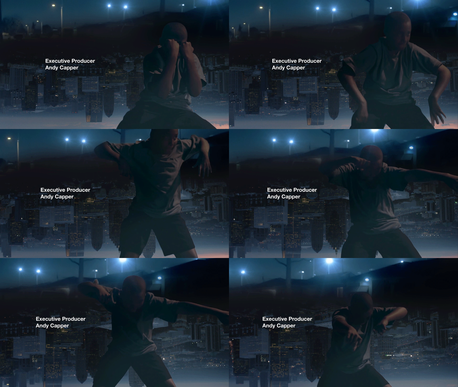
Mixing table buttons sliding up and down a track like cars moving along a city’s streets. The mixing desk led lights flicker like streets lights in the city’s night background.
4/6
![]()

5/6
![]()
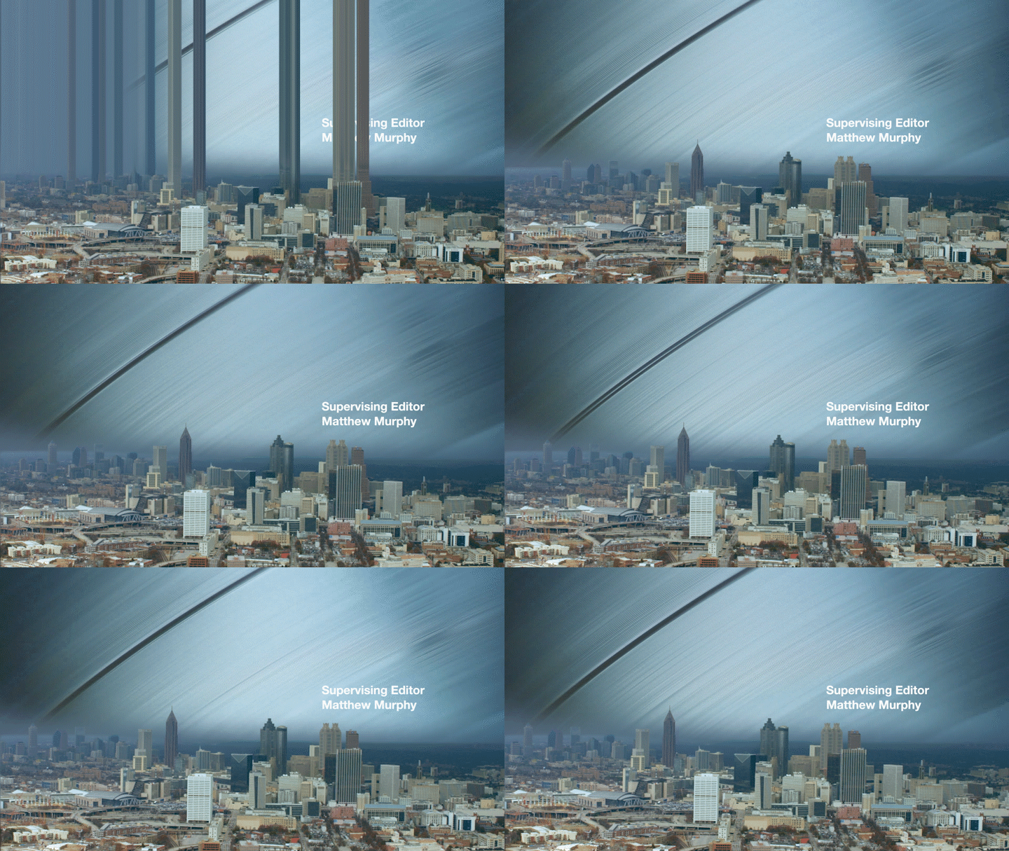
One of the fundamental requirements of the project was to show different aspects of the music scene, like dancing or recording in a studio.
I tried to present these elements without being too literal - to show these elements from a different angle. The show is presented as a sort of “road-trip” exploration, and I wanted to stay true to that concept, while blending the urban landscapes with musical components.
At the end of each title sequence, one extra shot was made especially for that show’s location, displaying the name of the city where the episode is happening. The challenge was to design and built it in a way that will be easy for other editors to type in the name of the new location without compromising the cohesiveness of the branding.
6/6
![]()
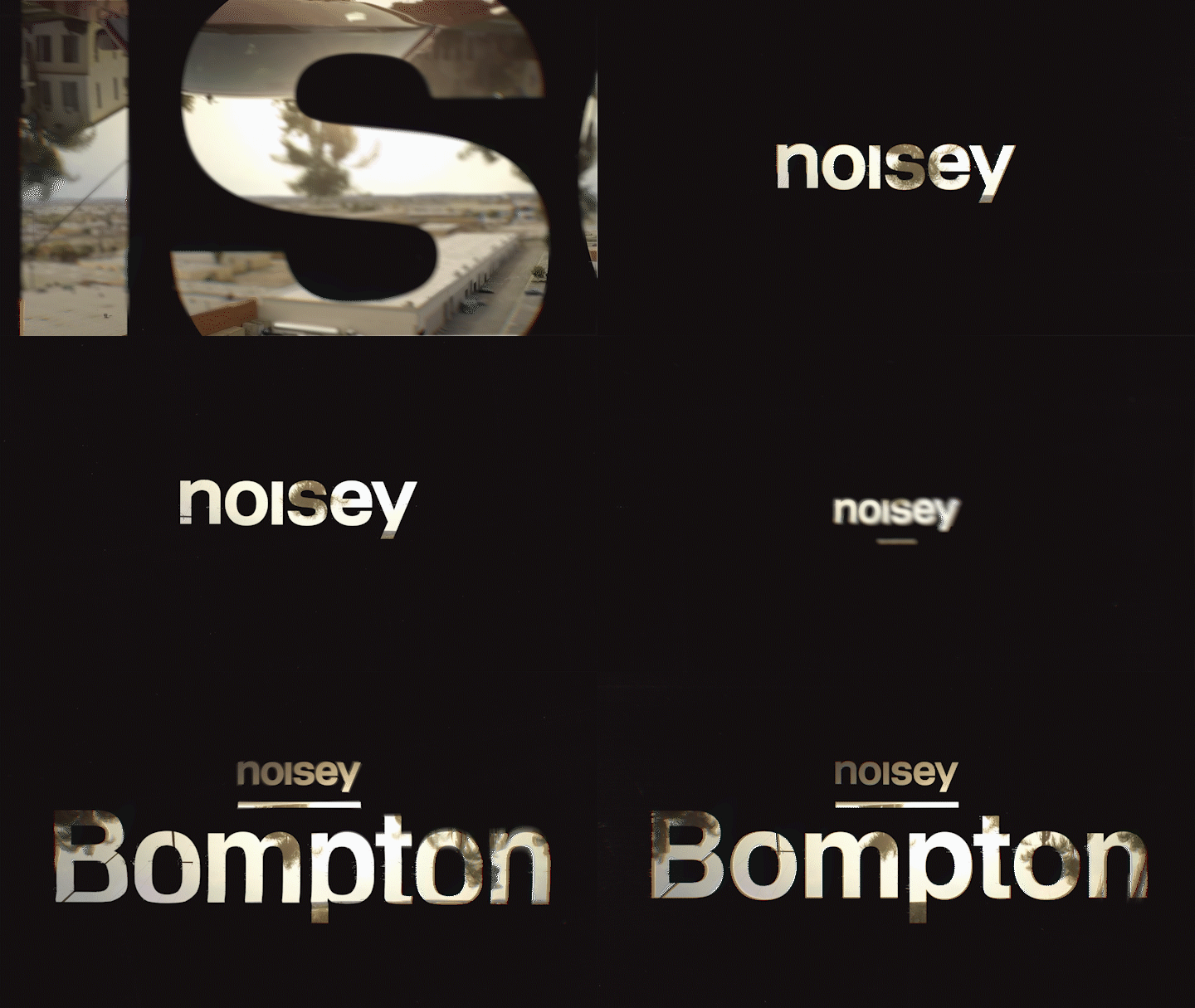
Lower-thirds
Lower-third proposition for the show. This version was well recieved by the Noisey team, but did not make it into the final production, as the automation of it was considered too technically challenging.
