Dr.Enzyme Branding of Singaporean soap company
Role: Naming, Concepting, Branding, Logotype, Art Direction, Graphic Design, Illustrations, Web Design, Instagram
Meiying Zhou is the inventor and founder of this unique and original product, an enzyme-based liquid soap company rooted in traditional Chinese medicine (TCM). It was born in China and is today situated in Singapore. Meiying Zhou, a traditional medicine practitioner, invented her own special formula to make a liquid “soap” using the TCM knowledge and philosophy. Meiying Zhou and her daughter Xi Chen (co-founder) needed a name and an entire branding for three lines of product Mrs. Zhou concocted.
In reference to Meiying Zhou’s background in Medecine and TCM I proposed them the name: Dr.Enzyme. She is genuinely referred to as Dr.Zhou by her peers.
In reference to Meiying Zhou’s background in Medecine and TCM I proposed them the name: Dr.Enzyme. She is genuinely referred to as Dr.Zhou by her peers.
To differentiate the three different lines, including a body soap line, a skin care and a home cleaner line, I suggested 2 lines name. One for the cleaners and one for the the skin care. For the cleaning lines I wanted to express the probiotic nature of the product in the name itself with “The Living Cleanser of Dr.Enzyme”. Therefore, the name encompasses the very essence of Dr.Enzyme’s concept with an element of intrigue.
Photography: Rose Clements
Photography: Rose Clements


Packaging Labels Design
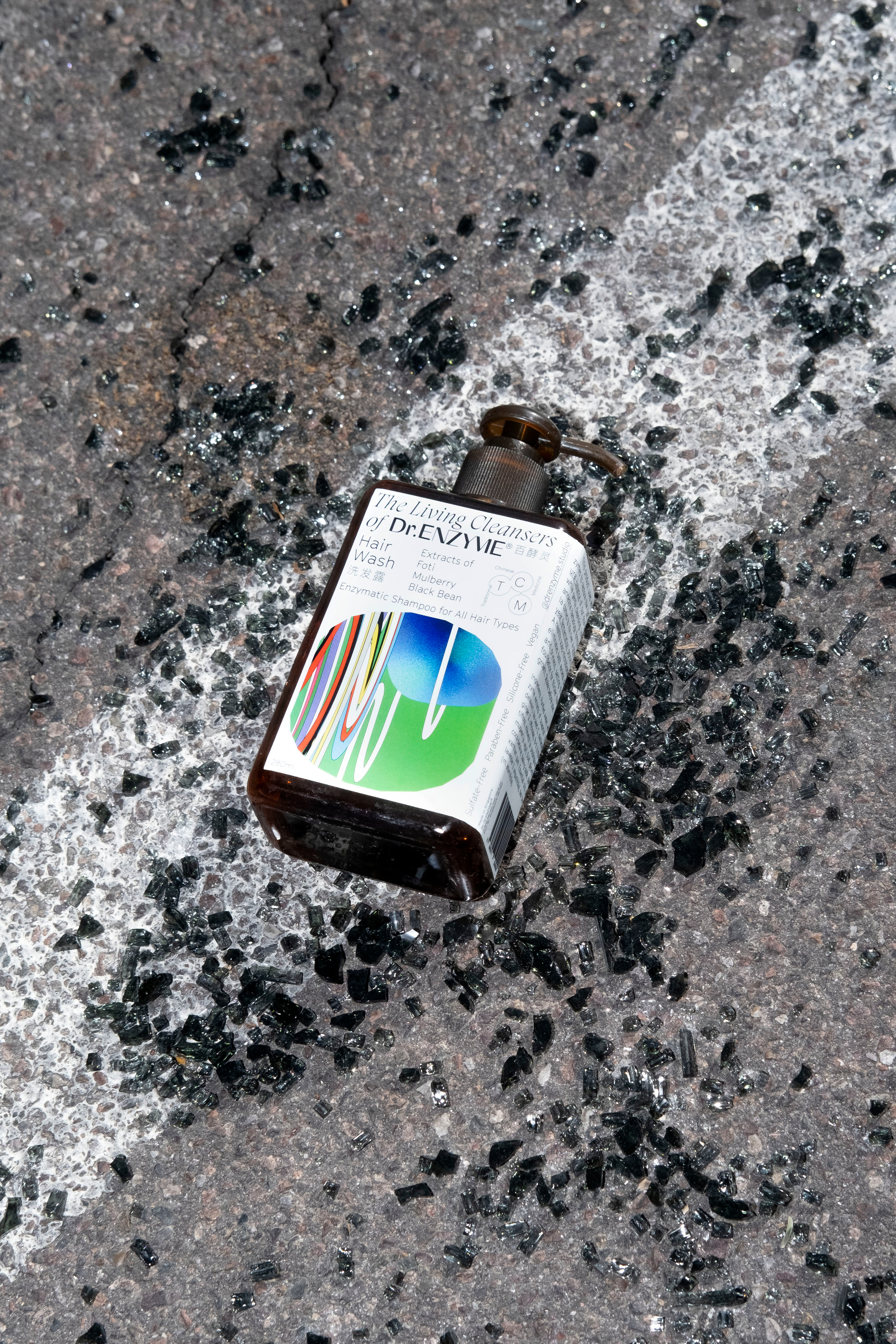
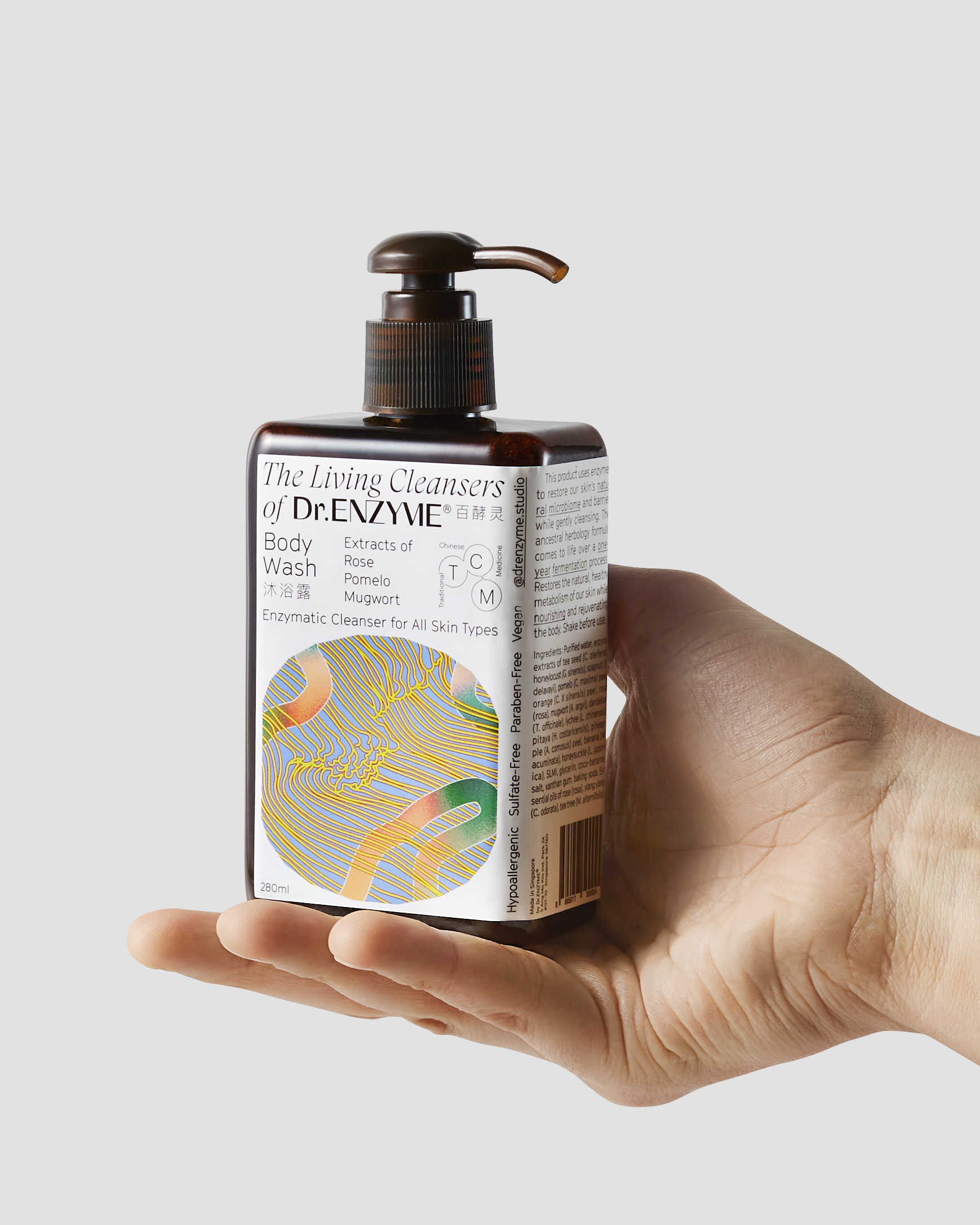
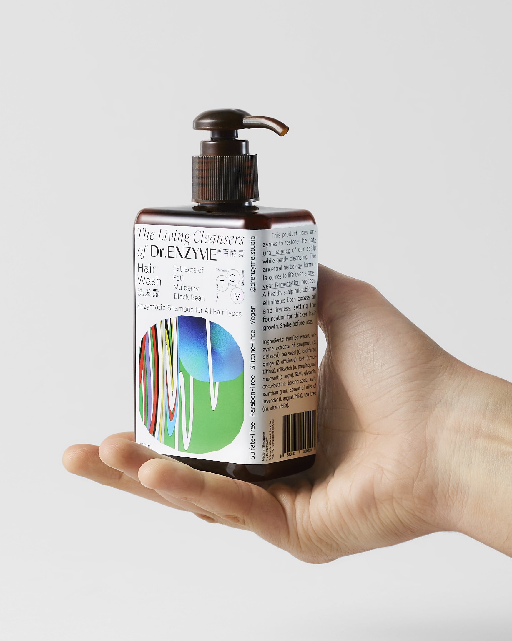
The design of the labels were separated in three different layouts and concepts. The body cleansers line consists in four products in two different sized bottle. In an effort to save material, ink, plastic and cost, I chose to use only one label per bottle. Depending on it’s shape, the label either sits on one side or wraps around the container.
The body cleansers line is the first line I designed establishing a mood and visual vocabulary for the branding. The inspiration was evidently in part medical and body care product, leaning more heavily on instructions and detailed product information. As Dr.Enzyme sits delicately between skin care and traditional Chinese Medecine, the apothecary iconography was a feeling that was required in my concept. However, the wholesomeness and all-natural self care aspect of the product calls for a comforting, pleasing and appealing aesthetic as well. I therefore got hands-on with a series of illustrations - one illustration per body cleanser line, four in total. Similiar to the packaging design, the first illustration became the moodboard for the others proceeding. These we sketched and colorized by hand before I digitalized them and turned them into vectors. These visuals were my attempt to transmit my fascination for the beautiful mystery of nature’s alchemy and the benefits of it’s living active compounds.They are meant to mirror the uniqueness of this uncommon liquid cleanser.
The enzyme-based essential oil lines of Dr.Enzyme differ in design from the other products in the collection. This set of packaging uses the logo, instructions, and ingredients laid out over a flat color. Each product has a different base color that represents one of the main active ingredients.
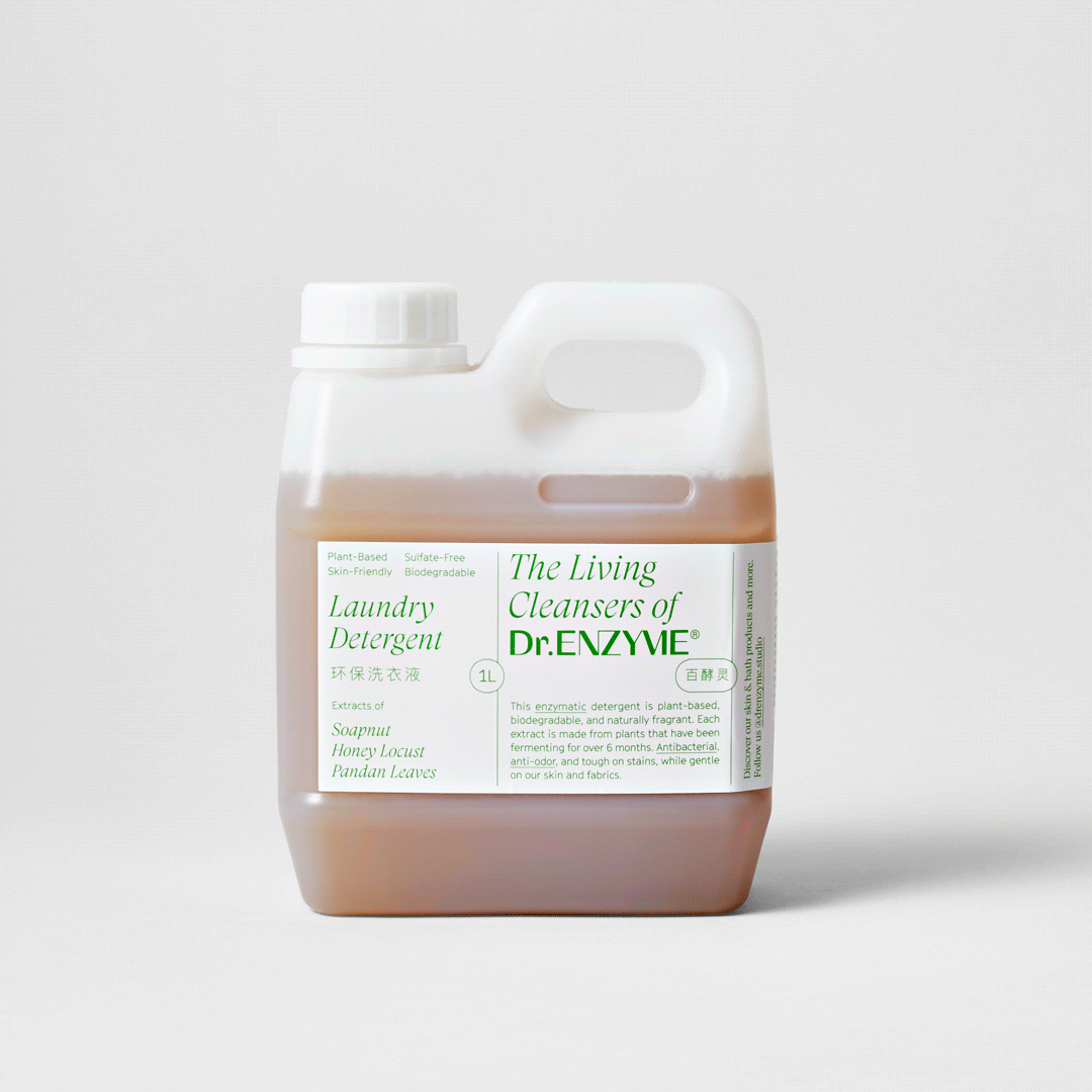
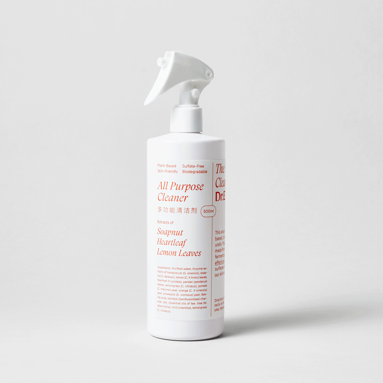
The last line of Dr.Enzyme products is used in the home for cleaning. In this line’s design, the challenge was to keep an aesthetic that connects with the rest of the brand yet differentiates itself from each distinct category of products.
This line consists of three products: Laundry Detergent, All-Purpose Cleaner, and Air Freshener. All three are laid out on a neutral white background with a unique single-color text. This respects the clean and eco-friendly nature of the product.


Logotype Design and Typography Selection
The logotype for Dr.Enzyme was created from scratch. My inspiration for these letter style came from a desire to find a typeface between the Optima font and a neo-grotesque extended like Helvetica. After failing at finding such explicit typeface I committed to design it. I drew the alphabet for the letters in all caps only. I then used this new font and refined it for the logo, adding a special flare in the connection between the letter Y and M of ENZYME.
For the label design I needed two more fonts to pair and contrast with the logo, one italic serif to complement in the name (The Living Cleansers of..) and one light neo-grotesque for the rest of the texts. The intention here was to convey innovation that integrates tradition. I chose two fonts from the great Grilli Type catalogue, the italic serif the GT Super, and the GT Cinetype. I found that between the logo design and these two fonts a very interesting combination was created. GT Cinetype has the singularity of having all its curves made from straight lines. When looking closely the O’s are actually hexadecagons, a circle with 16 straight sides. I therefore use the hexadecagons shape to frame the illustrations for the body line.
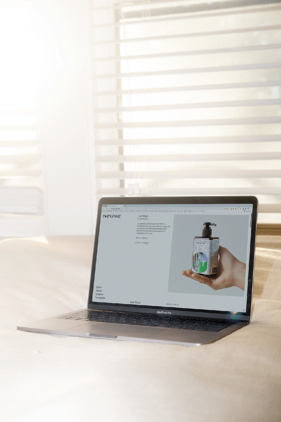
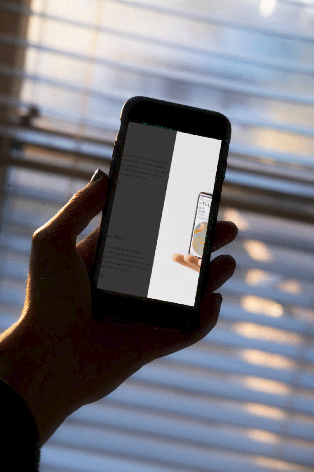
Website and IG
I designed a full responsive website working on mobile. I’ve customized the website using the Cargo 2 platform. I created the Dr.E logo for the IG profile picture and the colorful capsules.
Together with Xi Chen, I’ve art directed the first posts on their Instagram, the photoshoot for the e-commerce pictures and defined a style and chart for the team to follow.

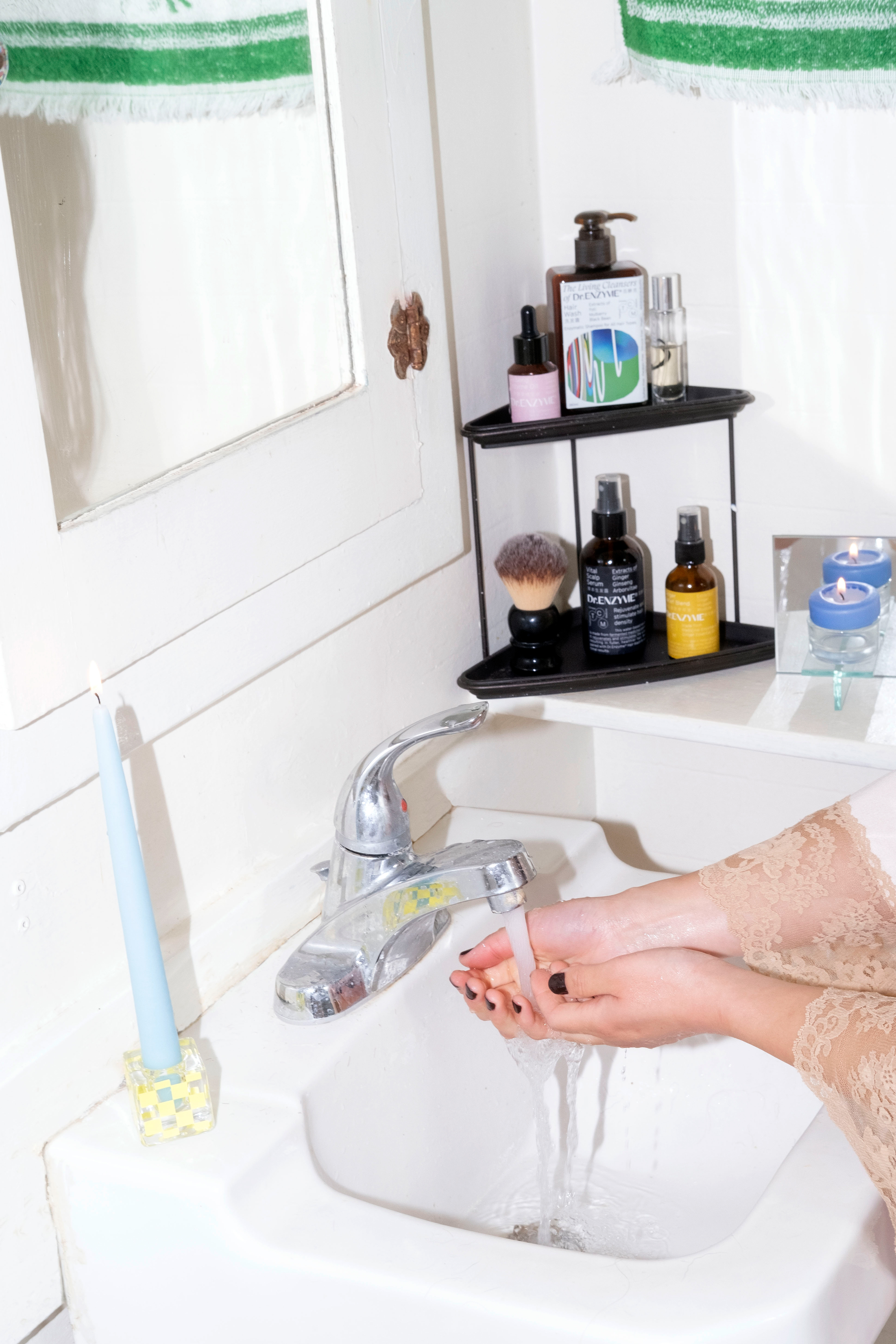


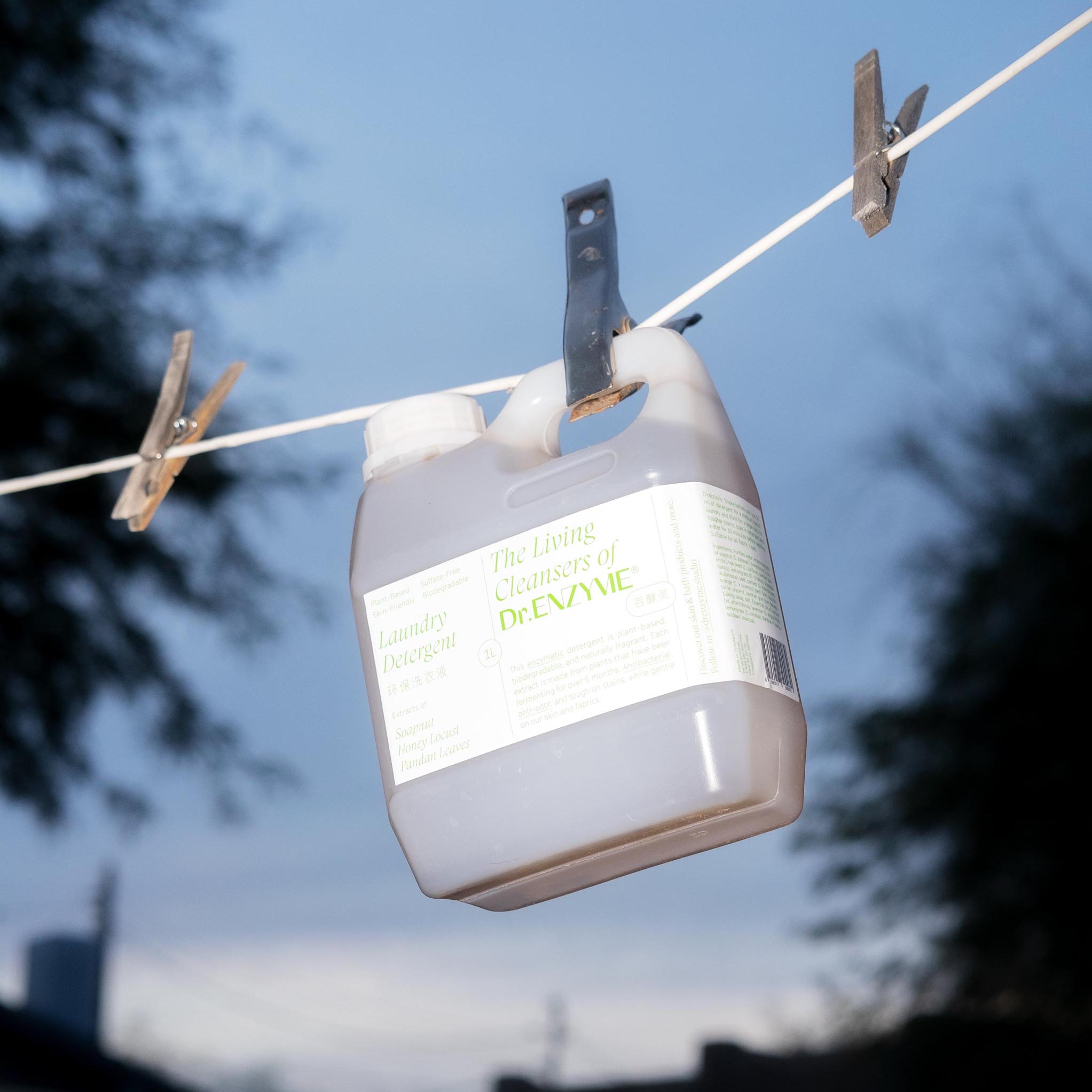

The lifestyle photos displayed for this case study were not commissioned by Dr.Enzyme. I hired Rose Clements to take photos to showcase my work.
This aesthetic isn’t part of Dr.Enzyme’s brand or chart but a creative freedom I gave to an indenpendent photographer I admire and support.