The Assassination And Mrs. Paine Graphics and title sequences
Role: Art Direction, Concepting, Graphic Design, Animation
Full Graphic and motion design package for feature film documentary
Film director Max Good and his producer Stephen Schmidt got in contact to get me on board and in charge of the entire graphic design, art direction, animation of Max’s feature documentary.
This documentary approaching JFK’s assassination from the perspective of Mrs.Paine’s life events, from the murder until this day. Throughout the years, numbers of declassified documents have been shinning a new light and rising new questions that the movie attempts to cover.
Max came to me with a vast batch of documents, transcripts, audio-recordings, graphs, maps, articles and photographs that needed to be highlighted, treated, explained and embellished. The title opening sequence needed to be concepted, design and animated, as well as all the chapter titles, interviews lowerthirds, interstitials, animated maps and diverse assets including the end credit sequence.
This project represented a great amount of work for one person as much as a wonderful opportunity to create an entire visual identity and motion design vocabulary, for this grand documentary that took seven years in the making.
To my flattering surprise, Max gave me full creative liberty over the art direction and concepting, making this project a very exciting endeavor and promising exploration.
As I’m hoping that it will translate without the need of an explanation, the concept I chose top go for after Max’s approval is the one of the “eclectic design catalogue”. A concept that rather than showing one straight forward design identity throughout the titles will do somehow the opposite. Proposing a different aesthetic for every chapter, using different fonts, design treatments and feel for all of them. Mimicking the plethora of aesthetic present in all the official documents showed in the film.
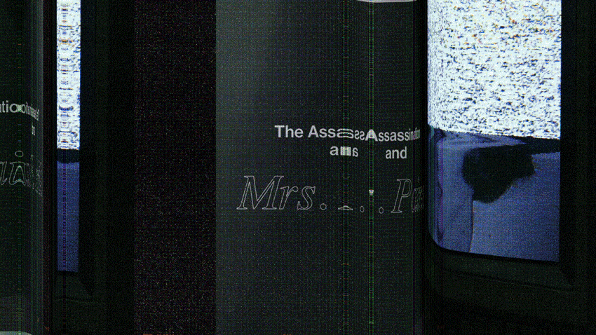
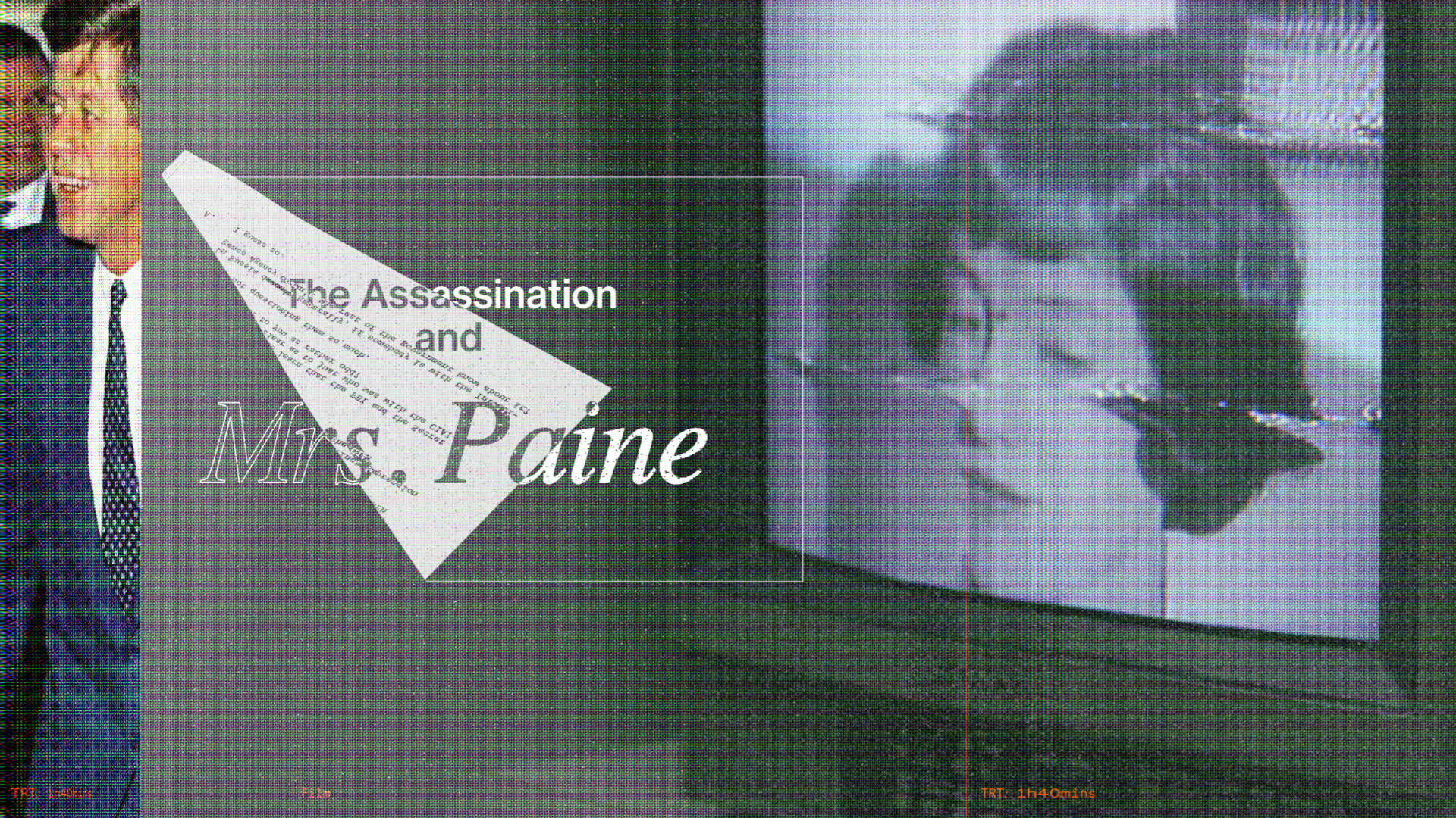
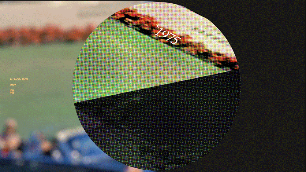
Animated clip of the title

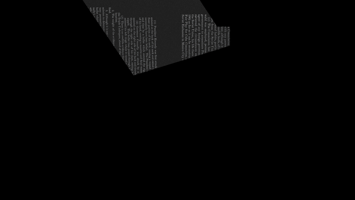
First frame of the title before in unfolds
Document revealing and filling out the outlines titles, the sheet of paper deploys, unfolds and clears out.
Document revealing and filling out the outlines titles, the sheet of paper deploys, unfolds and clears out.
My inspiration for the title was the visualisation of the concept “weaving”. Having a multitudes of textures, a screen / monitor texture, a halftone photocopy and the concept, weaved, folding and unfolding. Sheet of paper would unfold like origami and screens would unwarp itself like rolled up documents. Stretching and distorting like many versions of reality. As new documents are disclosed new narratives deploy and more frames unravels.
Serif Types:
Grotesque Types:
Monotype:
Grotesque Types:
Monotype:
GT Super, Times New Roman, Happy Times
Neue Haas Grotesk
Kale Sans Mono, GT America Mono
Neue Haas Grotesk
Kale Sans Mono, GT America Mono
Synopsis
Written by Max Good
Written by Max Good
The Assasination & Mrs. Paine is a provocative portrait of 83-year-old Ruth Paine and her inescapable connection to the assassination of president John F. Kennedy. The film juxtaposes Ruth’s personal experience of this tragedy against the wider cultural significance and controversy. This juxtoposition inspired the design of Fifty-two years after the assassination, she is one of the few surviving central witnesses and her story offers an intimate window into this foundational event in American history. At the heart of the film are the suspicions and accusations that have long been aimed at Mrs. Paine.
As benefactors of Marina and Lee Harvey Oswald, Ruth and her former husband, Michael Paine, became prime targets of conspiracy researchers, who view them as agents in a wider plot to frame Oswald. Ruth, in particular, is viewed as complicit in a vast and ongoing cover-up. Today, even as an anonymous resident of a Quaker retirement home in northern California, Ruth is still haunted by those who are convinced that she holds a secret to the crime of the century.
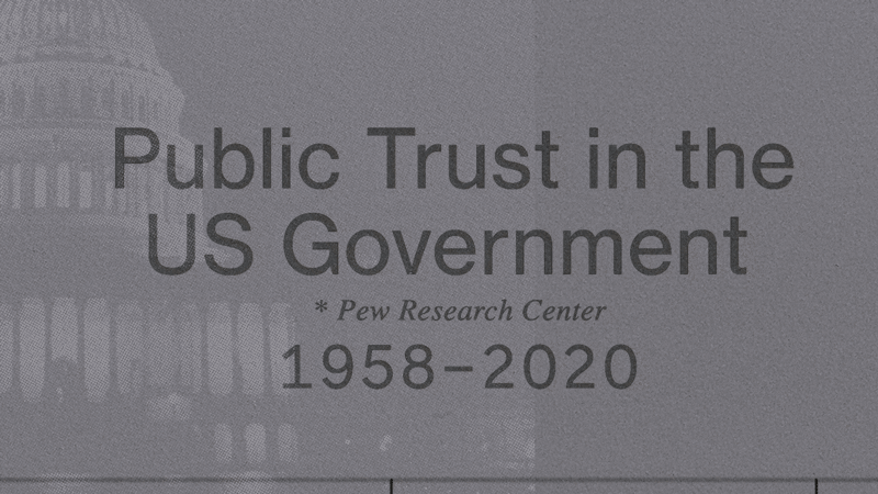
2. Chapters And Interstitials
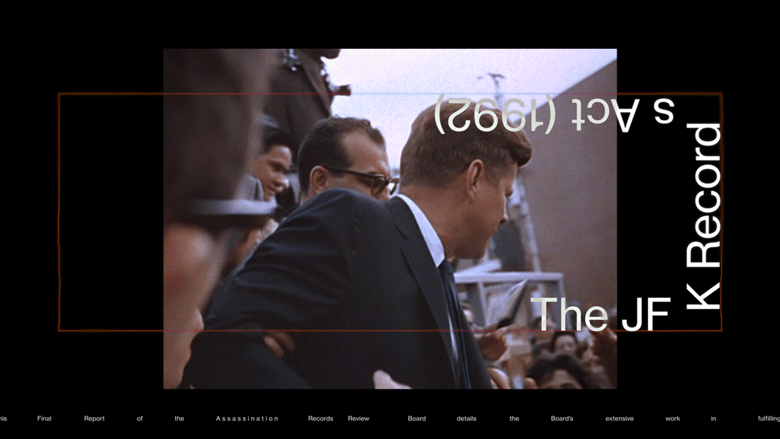
The film’s own design shows a vast eclectiveness. This interesting challenge still required that the viewer understood the difference between the film’s graphics and the ones coming from the official archives. We did keep graphic cohesion never the less within the lowerthirds and the titles cards, as that distinction would only add unnecessary confusion.
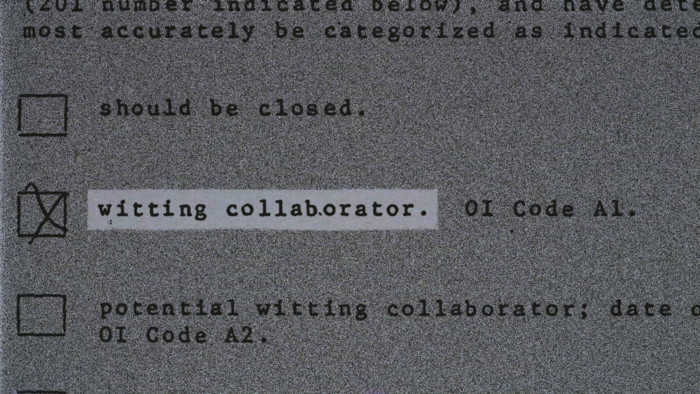
For the design style of this project I’ve exploited the diversity of elements present in the assets existing in the film: archive documents, the typewriter, halftone printed photographs, censoring marker lines, layering, camera lenses, dark room.
For the design style of this project I’ve exploited the diversity of elements present in the assets existing in the film: archive documents, the typewriter, halftone printed photographs, censoring marker lines, layering, camera lenses, dark room.
I was playing around with an aesthetic that lives within our collective consciousness. That commun iconography built over time through movies, news paper clips, documentaries has ingrained a mosaic of design worlds that I tried to tap into, to create a feeling of familiarity and yet a sense of novelty.
3. Documents
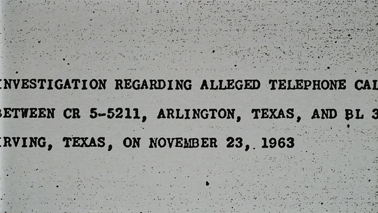
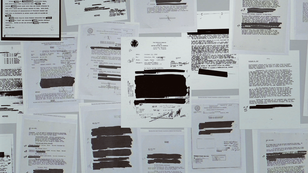
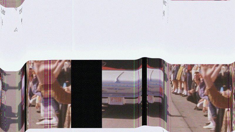
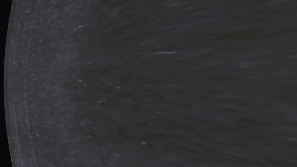
For the documents sections I have been listing multiple type of film grains, flickering textures, vibrances of video grids to put together a whole range of different feels, in an effort to bring loads of variation to maintain visual interest. The camera moves also evolves and use different ideas throughout the documents.
Sometimes it simulates a typewrites, sometimes it follows as the texts gets revealed or highlighted. I’m using the effect of the sheet of paper unfolding throughout the whole film as well and pages getting their warps flattened.
4. End Credits
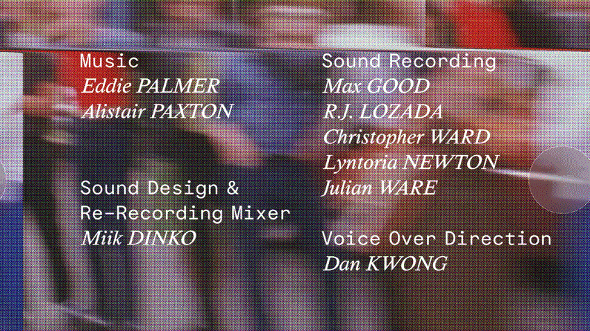
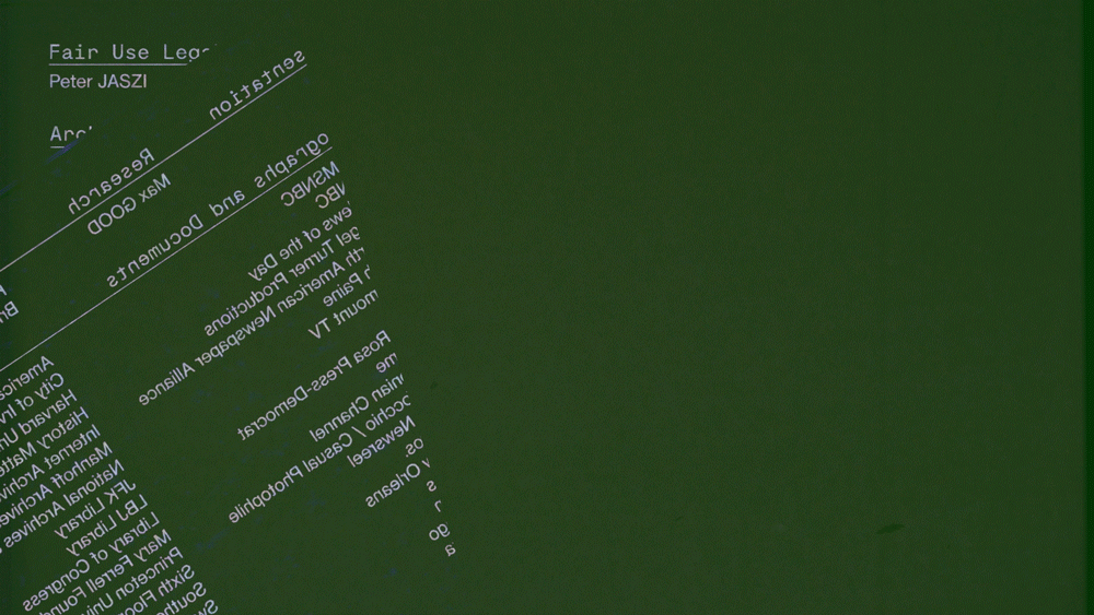
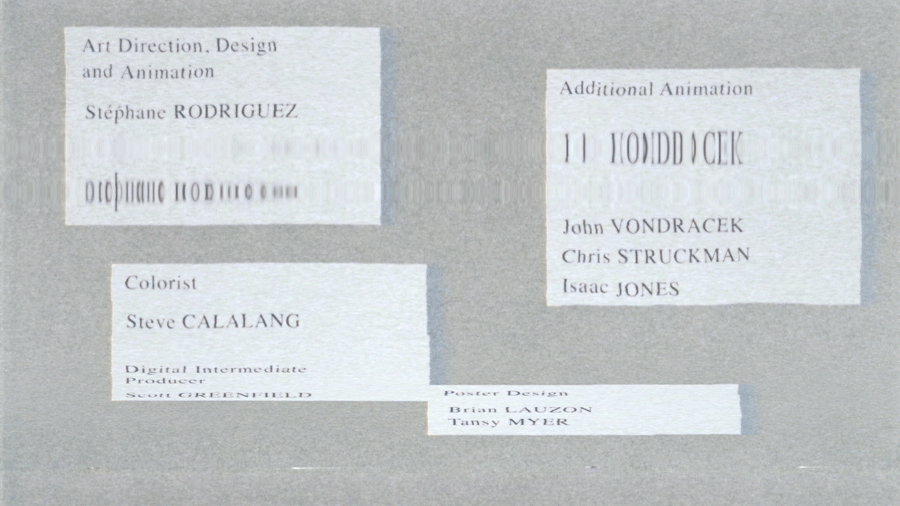
The end credits revisit some of the designs that were seen during the movie. I chose to upcycle some layouts as a way to remind the viewer of tge design environment that carrried us throughout the movie and recalls parts, moments and key chapters.
Almost functioning as a closing reel, highlighting design episodes like a showreel of the whole film’s graphic and motion indentity.