The Page Burner Title Sequence
Role: Graphic Design, Typography, Art Direction
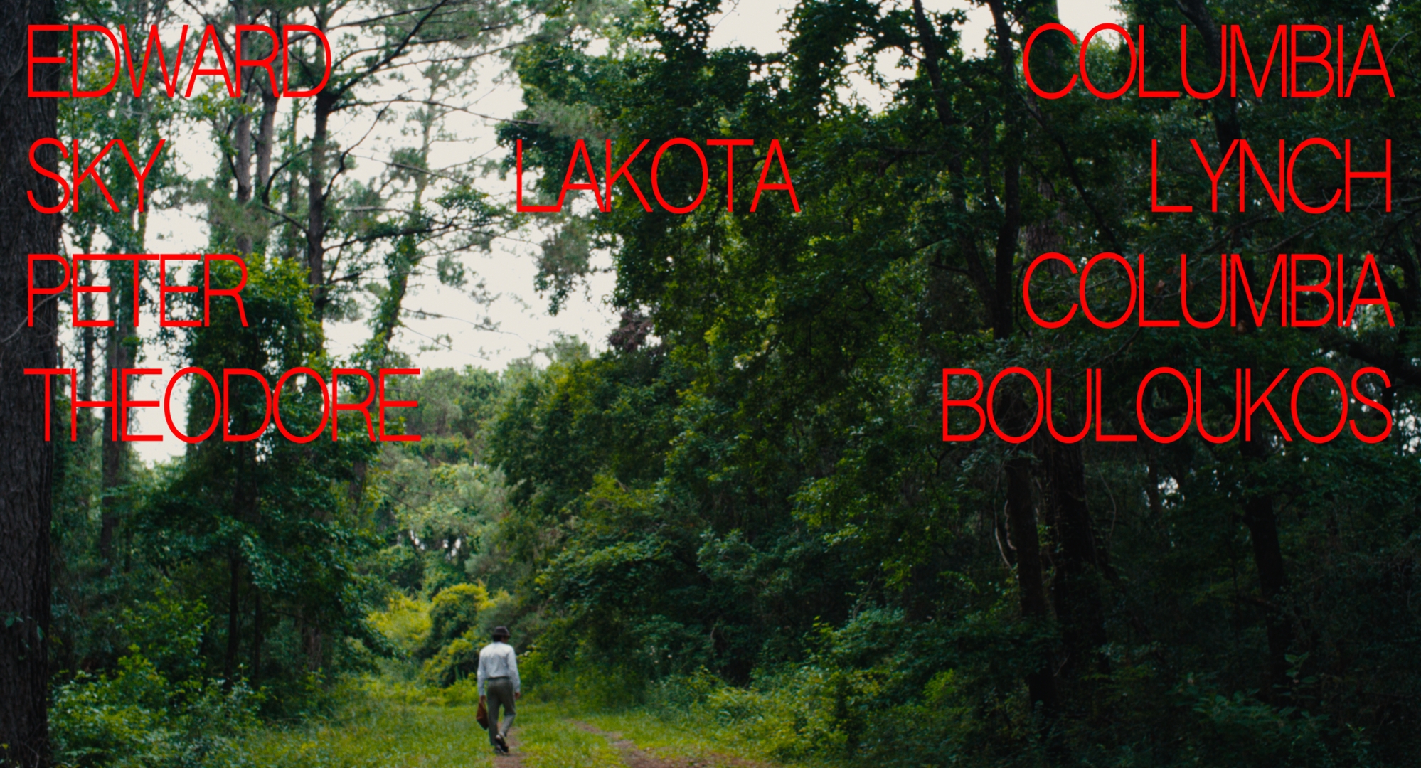
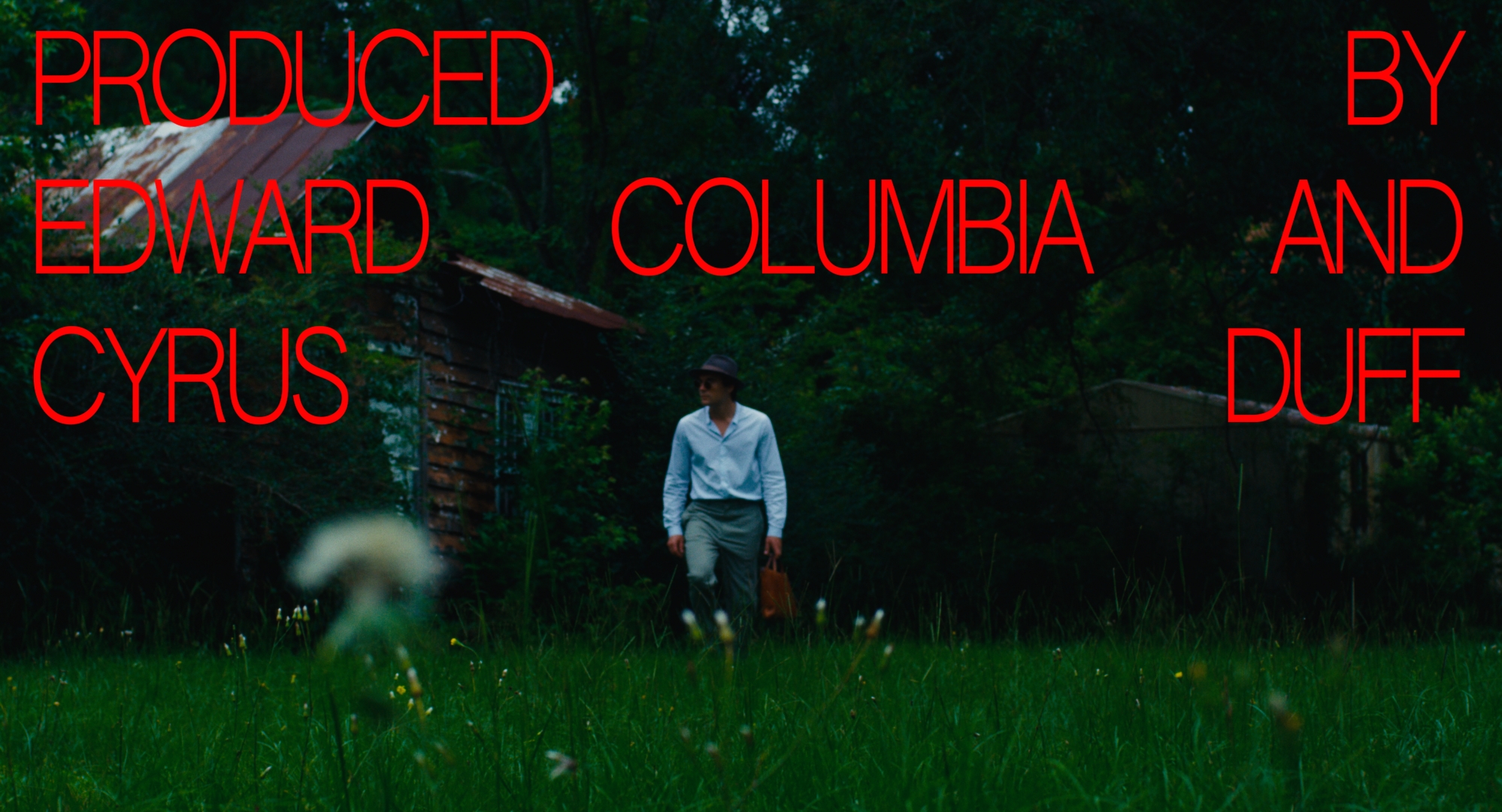
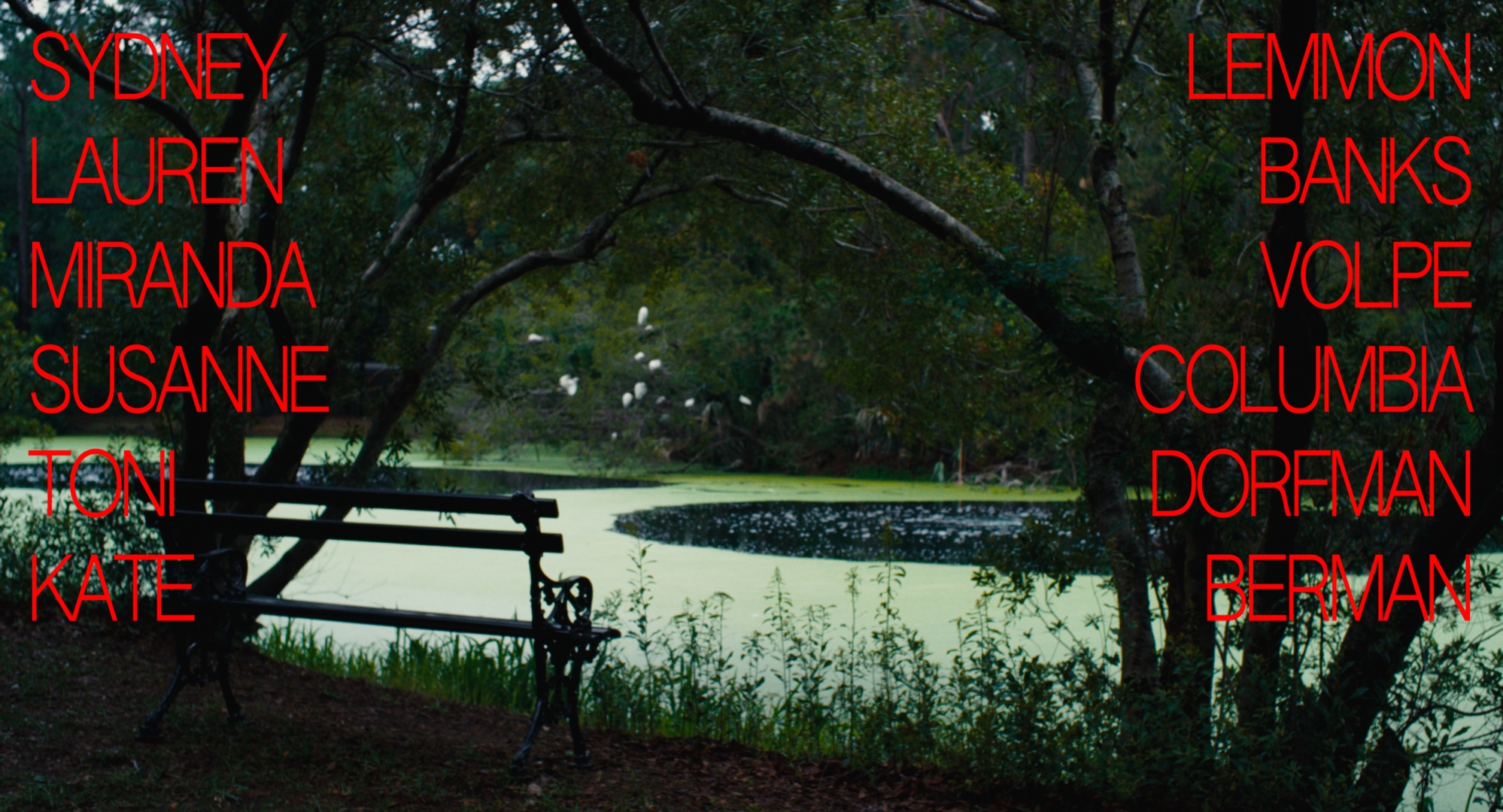
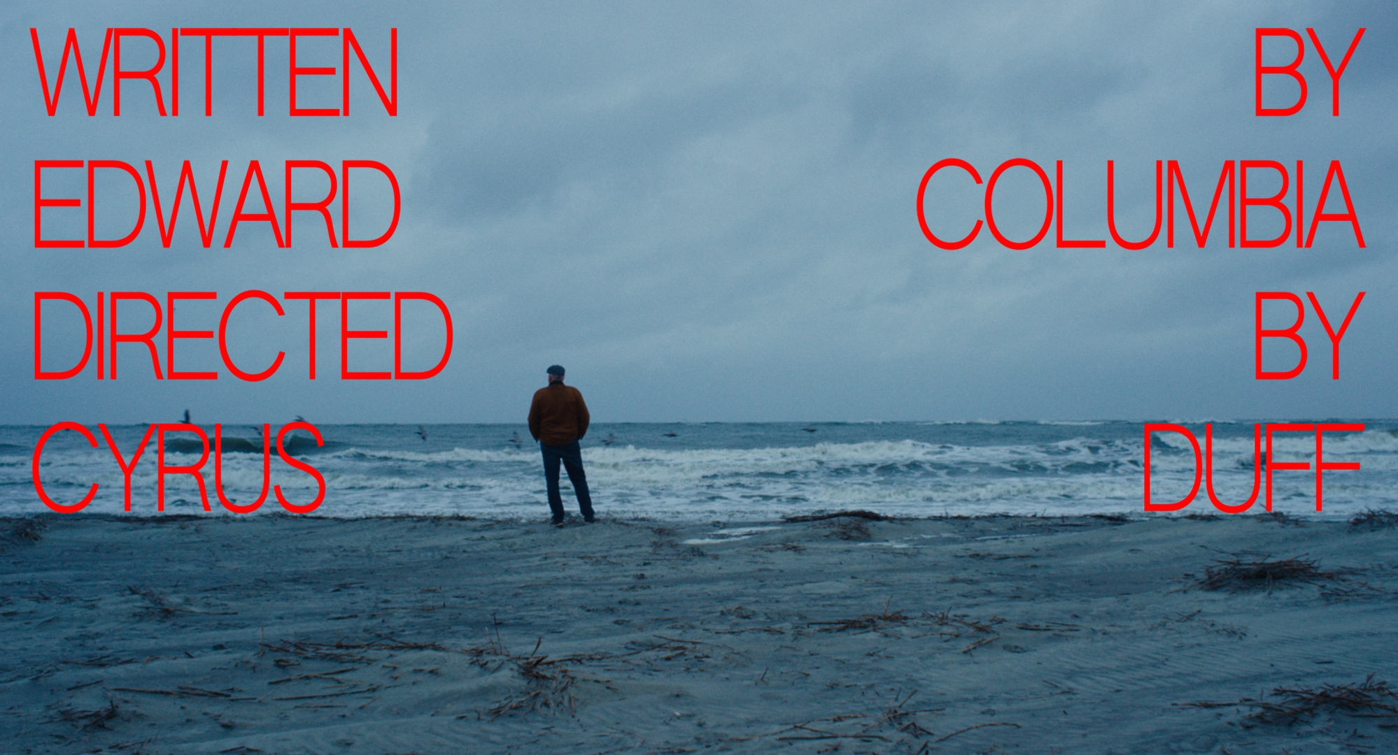
A thriller drame feature film by Edward Columbia and Cyrus Duff. For this very brut opening credit, we had discuss with Cyrus about the importance of a strong contrast, both esthetically and conceptually. The movie being very poetic and introspective motivated the idea graphics that would go the other way and create a dichotomy. From there came the uncompromised radical design choices. Offering another layer of complexity to the film’s esthetic and story. I was very pleased that Cyrus and I synched up instantely with these compositions of big uppercase in a vibrant red.
This intentional edgy look using the complementary color palette dialogue between images and typography. The font choice is Authentic sans, a grotesk on which I have reduced the spacing, squeezing and giving a false feeling of distorsion. The desire was to bring more radicality and vibrance to the layouts. The grid concept is systematic all the way through to the title where all text blocks are aligned on the top of the frame. We intentionally chose to keep the font’s edges sharp and raw, to insist with our concept.
Synopsis